
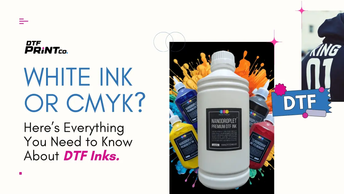
White Ink or CMYK? Here’s Everything You Need to Know About DTF Inks
Direct-to-Film (DTF) printing is a modern textile printing method that transfers digital designs onto fabrics using a film and adhesive powder system. Unlike traditional methods like screen printing or sublimation, DTF allows printing on a broader range of materials, including cotton, polyester, and blends, with excellent color fidelity and durability. A key factor in DTF’s output quality lies in how it uses white ink and the CMYK color model, each playing a distinct role depending on the substrate and intended result.
What Is White Ink and Why It Matters in DTF
White ink serves a fundamental role in DTF printing, especially when working with dark or colored garments. It functions as an underbase layer, providing a neutral and opaque background that enhances the visibility and vibrancy of subsequent color layers. Without this white foundation, colors like cyan and yellow can appear dull or distorted when printed directly onto non-white fabrics.
In DTF workflows, white ink is typically printed first, followed by CMYK layers. This ensures that the color stack sits on a reflective base rather than soaking into the textile surface. The opacity of the white ink is critical; it must be thick enough to mask the garment color but still thin enough to maintain fine detail in the print.
For many printers, managing white ink consistency is a key operational focus. This includes regular agitation, filtration, and nozzle maintenance to prevent settling or clogging. If white ink is poorly maintained, it can lead to streaking, poor adhesion, or uneven curing during heat pressing.
Most DTF printers support dedicated white ink channels, and these must be configured correctly within the RIP software. For instance, some machines remap channels 5 and 6 to white ink and enable simultaneous color/white layering modes. Proper channel calibration ensures that white ink doesn’t overpower CMYK tones or lead to excessive ink buildup.
CMYK in DTF: Role, Calibration, and Coverage
The CMYK color model—standing for Cyan, Magenta, Yellow, and Black—drives the color reproduction process in nearly all digital print workflows. In DTF printing, these inks are layered on top of the white underbase to create the full color range of a design.
CMYK-only printing is suitable when transferring designs to light or white garments where a white underbase is not needed. This eliminates one ink layer, reduces material usage, and speeds up production. However, it places higher importance on color calibration, as color distortion can be more visible without the neutral buffer provided by white ink.
Print quality in CMYK-only workflows often depends on several factors:
- Ink saturation levels
- Media coating on the film
- Head temperature and environmental humidity
To ensure accurate color output, printers often rely on ICC profiles tailored to the specific DTF ink and film combination. These profiles help align digital color data with actual ink deposition behavior.
Designers must also consider color gamut limitations in CMYK printing. Unlike RGB displays, CMYK cannot reproduce highly saturated tones like neon green or electric blue. This constraint is further complicated when working on colored fabrics without a white base, as the textile’s color will interact directly with the printed ink.
For a deep dive into CMYK process standards, check out Adobe’s color workflow guide.
Choosing Between White Ink and CMYK: What Affects the Decision
The decision to use white ink or rely on CMYK-only printing depends on several factors:
- Fabric color: Dark materials require white ink for image clarity
- Print detail: Complex or fine-lined graphics benefit from a solid underbase
- Cost and speed: White ink adds an extra step and material cost
- Print durability: Opaque white helps inks resist cracking and fading
For light-colored cotton or polyester garments, CMYK-only prints are sufficient and more economical. But for black hoodies, navy t-shirts, or richly pigmented fabrics, omitting white ink can result in poor contrast and a faded appearance.
Some advanced DTF workflows use variable underbase printing, where white ink is selectively applied based on image zones. This reduces ink consumption and speeds up processing while retaining visual integrity where it’s most needed.
White ink adds cost but enhances impact. CMYK alone saves time but is context-sensitive.
The Role of Underbase Printing in Visual Clarity
Underbase printing refers to the deliberate placement of a white ink layer beneath the CMYK colors during the DTF transfer process. This technique is especially critical when printing on dark or patterned garments, where the base color can otherwise distort or mute the printed design. A properly applied underbase ensures that light and mid-tone colors remain vibrant and accurate, no matter the underlying material.
In practice, underbase logic is embedded in the print file setup or handled automatically by the RIP software. For example, a shirt design with both light and dark regions may call for partial underbase application, allowing the software to deposit white ink only beneath areas requiring strong color integrity.
This process is directly influenced by:
- White ink density settings
- Image transparency zones
- Underbase choke (slight reduction in white area to avoid bleed around edges)
A misaligned underbase can cause a halo effect, where the white ink peeks out around color edges, especially in high-contrast graphics. Skilled designers and operators manage this by fine-tuning the choke margin and calibrating for film stretch or shrinkage during transfer.
How Adhesive Powder Supports Fabric Bonding
Once the ink is deposited on the film, adhesive powder is applied to the wet surface. This fine-grain powder acts as the bonding agent between the film-printed ink and the garment. When heated, the powder melts into a sticky layer that physically fuses the image to the fabric surface.
Different powder types are optimized for different fabric types:
- Standard hot-melt powder: Works well for cotton and blends
- Low-temperature powder: Designed for polyester or heat-sensitive garments
- Fine vs coarse grain: Impacts coverage smoothness and curing behavior
Proper powder application is critical. Uneven coating can result in spotty adhesion, where parts of the design lift or crack after washing. To prevent this, DTF operators typically use:
- Auto powder shakers with vibration plates
- Powder tunnels with air scrubbing and leveling features
- Manual powder stations for short runs
Operators must also remove excess powder before curing to avoid edge flaking or sticky surfaces post-transfer. This is typically done by shaking or gently tapping the film before it enters the curing chamber.
Heat Press Settings and Their Impact on Transfer Quality
After printing and powder application, the transfer film is pressed onto the garment using a heat press. The temperature, time, and pressure settings at this stage directly influence the quality, durability, and feel of the finished print.
Common baseline settings include:
- Temperature: 300–325°F (149–163°C)
- Time: 10–20 seconds
- Pressure: Medium to firm (30–50 psi)
These parameters vary based on:
- Type of garment (cotton vs polyester)
- Type of powder used
- Climate and humidity levels
One of the key transfer challenges is ghosting, where part of the image shifts during press lifting, leaving a blurred shadow. This is usually a result of:
- Improper cool-down timing
- Overly aggressive peel technique
- Inconsistent pressure distribution
Some operators prefer hot peel films for faster workflows, while others choose cold peel films to improve detail retention and ink bonding.
Maintaining even pressure and flat garment alignment helps eliminate pitting, cracking, and non-adherence. Advanced presses include automatic pressure sensors, pre-press steamers, and vacuum platens to ensure consistency, particularly for bulk orders.
Ink Saturation, Opacity, and Coverage Optimization
Ink saturation refers to how heavily ink is deposited onto the film. High saturation improves vibrancy but may cause over-wetting, resulting in bleeding, color shift, or adhesion failure during curing. Conversely, low saturation can produce washed-out prints or thin, brittle transfers.
Opacity is especially relevant in white ink applications. If the white underbase is too thin, the colors layered on top will blend with the fabric tone, especially on dark materials. Too much opacity, however, can lead to a thick, plastic-like texture and longer curing times.
Operators use test prints, film sampling, and ink curve adjustments in the RIP software to find optimal balance. RIP tools allow precise tuning of:
- Channel-specific ink limits
- Dot gain compensation
- Color linearization curves
Print quality is also affected by the type of film used. Glossy films tend to enhance brightness but may introduce glare, while matte films offer a softer hand feel and better ink acceptance.
In professional DTF environments, monitoring tools like spectrophotometers are used to verify color consistency and opacity targets across runs. This level of control is essential for brand consistency, especially in fashion and promotional printing sectors.
Printhead Technology and Ink Channel Configuration
Printhead technology plays a major role in the performance of a DTF printer. Most DTF systems rely on piezoelectric printheads, commonly from Epson, due to their ability to handle high-viscosity pigment inks like white. These heads are designed to eject ink droplets with precision, ensuring detailed output and consistent coverage.
Channel configuration is critical when setting up a DTF printer. Standard models include six to eight ink channels, which must be assigned properly across white ink, CMYK, and sometimes cleaning fluid or flush channels.
A common configuration might be:
- Channels 1–4: CMYK
- Channels 5–6: White ink
- Channels 7–8: Optional cleaning solution or extended white
Correct mapping ensures that white ink is only triggered where needed and does not interfere with color deposition. Misconfigured channels can lead to mixed ink flow, nozzle damage, or layer overlap errors.
Operators must also perform regular printhead maintenance, including:
- Nozzle checks
- Automated purges
- Manual cleanings
Failing to maintain the white ink channel can result in clogging, misfiring, or inconsistent underbase coverage. Some workflows require daily agitation of white ink tanks to prevent pigment separation, which is especially important for bulk ink systems.
Color Gamut Control and Print Calibration
Color gamut refers to the complete range of colors a printer can reproduce. DTF systems typically use pigment inks, which offer a broader gamut than dye inks but are still limited compared to RGB displays.
To achieve color accuracy, operators must calibrate their systems using:
- ICC profiles
- Media profiles
- Ink limit curves
These profiles align the digital file with actual ink output, compensating for substrate color, ink density, and film absorption. Calibration tools such as densitometers or spectrophotometers help fine-tune these settings.
Without calibration, even minor ink variations can cause color drift. This is particularly critical for brand-sensitive printing, where logo consistency is non-negotiable. DTF operators often run test swatches and compare output to Pantone targets for verification.
Furthermore, media variables—such as glossy vs matte film or coated vs uncoated substrates—affect both gamut range and visual output. Matte films tend to absorb more ink and reduce glare, while glossy films enhance brightness but can increase dot gain.
Optimizing Support Content and Query Discovery
As DTF technology gains popularity, end users increasingly seek answers online about ink configuration, pressing issues, film compatibility, and white ink use cases. Creating structured and clearly written support content helps streamline issue resolution and reduce service load.
Effective support content should:
- Use natural question phrasing, like “Do I need white ink for black t-shirts?”
- Group related topics under problem categories (e.g., Adhesion Issues, Color Fading, Film Curling)
- Include step-by-step procedures with labeled diagrams or photos
- Provide exact parameters for temperature, pressure, and ink ratios
FAQ sections should cover common troubleshooting points like:
- “Why is my white ink not adhering?”
- “Can I print without a white layer on gray fabric?”
- “How do I prevent ghosting during peel?”
Video tutorials, printable reference charts, and live setup walkthroughs help reinforce user understanding while reducing the need for technical intervention.
Additionally, educational articles should explain:
- Why underbase matters
- When CMYK alone is sufficient
- How to adjust RIP settings for variable fabrics
When content is designed around real user phrasing and goals, it not only improves discoverability but also enhances user satisfaction and product trust.
Conclusion: Making the Right Choice Between White Ink and CMYK
White ink and CMYK serve complementary roles in DTF printing. Choosing between them depends on material, design, and production goals. White ink is essential for dark garments and sharp detail, while CMYK-only workflows offer speed and cost advantages for light fabrics.
Operators must weigh:
- Fabric type
- Design complexity
- Ink costs
- Color vibrancy requirements
Investing in calibration, maintenance, and well-structured content can improve both print quality and operational efficiency. As the DTF landscape evolves, informed decision-making and effective resource sharing will continue to drive successful outcomes for both hobbyists and commercial users.