
Color Correction for DTF Printing: Achieve Vibrant Results
Have you ever wondered why some DTF prints look like they could leap off the fabric, while others just sit there dull and uninspired?
It all boils down to color correction, folks. As someone who’s spent more late nights than I’d care to admit tweaking settings and testing techniques, I can tell you firsthand—getting those colors to pop is a game-changer.
It’s not just about pressing “print” and hoping for the best; it’s about blending a bit of science with a dash of creativity.
In this article, I’m spilling the beans on how to achieve vibrant results in your Direct to Film (DTF) printing. Whether you’re new to the game or a seasoned printer looking to level up, there’s something here for you.
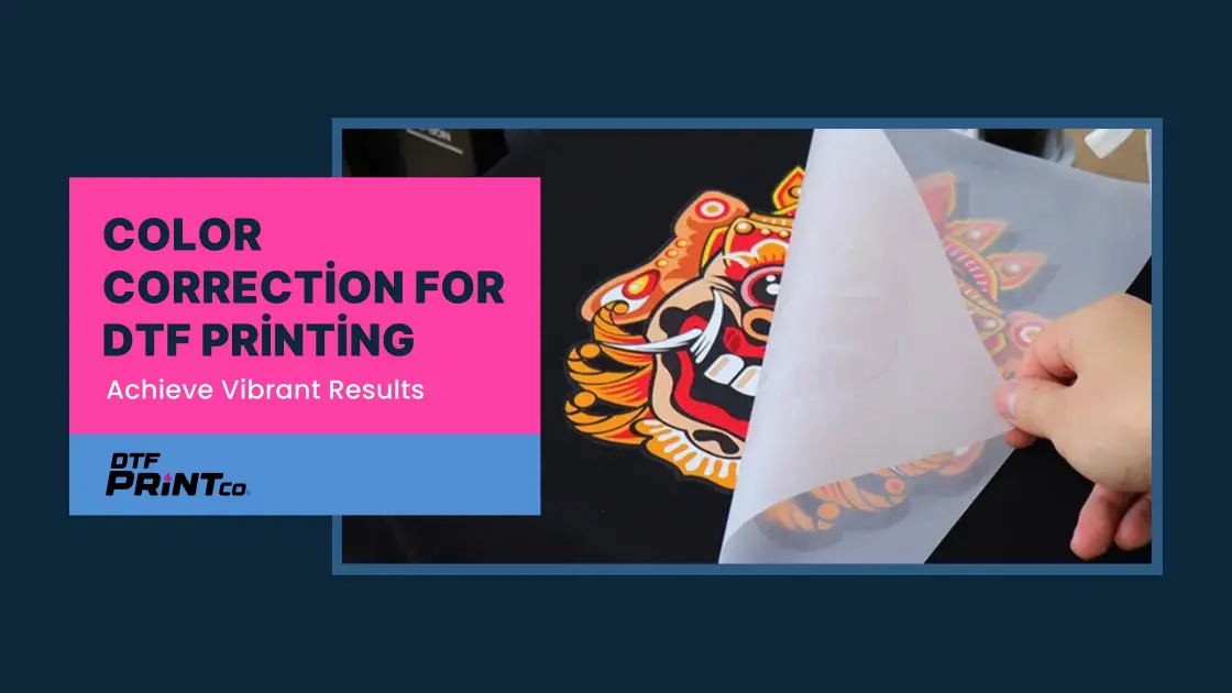
What’s DTF Printing Anyway?
Before we get into the nitty-gritty, let’s set the stage. DTF printing—Direct to Film—is a slick method where you print designs onto a special film, then use heat to transfer them onto fabric.
It’s a favorite for its versatility (think cotton, polyester, blends—you name it) and its knack for delivering bold, detailed prints.
But here’s the catch: without proper color correction, even the coolest designs can fall flat. That’s where high-quality materials, dialed-in printer settings, savvy color management, and smart design choices come in. Let’s break it down step by step.
Materials Matter: Start with the Good Stuff
You know that old saying, “You can’t make a silk purse out of a sow’s ear”? Well, it’s spot-on for DTF printing. If you skimp on materials, no amount of color correction wizardry will save your prints. So, let’s talk about what you need to set yourself up for success.
High-Quality Inks
First up: inks. You’ll want CMYK-optimized DTF inks—these bad boys are formulated specifically for this process. CMYK stands for Cyan, Magenta, Yellow, and Key (Black), the color model printers use to mix a wide range of hues. These inks offer a broad color gamut (that’s fancy talk for “lots of color options”) and top-notch accuracy. Think of them as the premium fuel for your printer—they keep the engine humming and the colors popping.
I’ve seen the difference myself. Once, in a pinch, I used some generic ink I had lying around. Big mistake. The colors came out muddy, and the vibrancy was nowhere to be found. Lesson learned: stick with inks labeled for DTF printing. Trust me, it’s worth the investment.
DTF Films
Next, let’s chat about films. Not all films are created equal, and for DTF, you need ones designed for the job. These films are engineered to hold ink like a champ, ensuring every drop sticks where it’s supposed to and contributes to that vibrant finish. A good DTF film acts like a canvas—it’s got to support the ink without letting it smear or fade.
I’ll admit, I’ve cut corners before and tried a cheap, generic film. The result? A print that looked like it had been left out in the rain—dull and disappointing. Now, I always double-check that my films are DTF-specific. It’s a small choice that makes a big difference.
Quick Tip: When shopping for inks and films, look for products explicitly labeled for DTF printing. They’re tailored to work together, saving you headaches (and wasted materials) down the line.
Optimize Printer Settings: Dial It In
Alright, you’ve got your top-tier inks and films loaded up. Now it’s time to make sure your printer is ready to bring the heat—literally and figuratively. Printer settings can feel a bit techy, but don’t worry; I’ve got your back. Here’s how to tweak them for vibrant results.
Color Profiles
First stop: color profiles. These are like the translators between your design software and your printer, ensuring the colors on your screen match what hits the fabric. Most DTF printers come with pre-set profiles, but you might need to pick the one that fits your setup best. Check your printer’s manual or the manufacturer’s site for guidance.
Not sure where to start? I usually go with the profile recommended for my ink and film combo—it’s a solid baseline. From there, a test print or two helps me see if I need to adjust.
Ink Density
Next up, ink density. This setting controls how much ink gets laid down on the film. Too little, and your colors look faded; too much, and you’re risking smudges or bleeding. It’s all about finding that Goldilocks zone—just right.
I tend to start with the default settings and tweak based on what I see. For bright, punchy colors, a slightly higher density can work wonders, especially on darker fabrics. Play around with it and keep an eye on the results.
White Ink Settings
Now, let’s talk white ink—it’s the unsung hero of DTF printing. White ink often serves as an underbase, especially on dark fabrics, making your colors stand out. Adjusting the density, limit, and underbase settings can turn a so-so print into a showstopper.
I remember printing a design on a black tee once. The colors looked lifeless until I bumped up the white ink density. Boom—instant vibrancy. It’s like giving your colors a stage to shine on. Experiment with these settings; they’re a game-changer.
Resolution
Resolution matters too. For crisp, vibrant prints, aim for at least 300 DPI (dots per inch). Anything less, and you might lose detail, which can dull the overall effect. High resolution keeps those edges sharp and the colors bold.
Calibration
Finally, don’t sleep on calibration. Over time, printers can drift out of whack, messing with color consistency. A quick calibration brings everything back into line. I make it a habit to calibrate every few weeks—or before a big job. It’s like giving your printer a tune-up to keep the performance tight.
Pro Tip: Run test prints after tweaking settings. It’s the best way to see what’s working and what needs a little more love.
Color Management Techniques: Fine-Tune Like a Pro
So, your materials are on point, and your printer’s humming along. But there’s more to the story—color management techniques can elevate your prints from decent to dazzling. Let’s break it down.
Saturation and Contrast
Think of saturation and contrast as the seasoning for your colors. Saturation cranks up the vividness—more saturation, more “wow.” Contrast, meanwhile, makes those colors stand out by defining the light and dark areas. A little tweak here can go a long way.
But here’s the trick: don’t overdo it. Too much saturation, and your print might look like a neon sign gone rogue. I usually nudge these settings in small increments, checking the vibe with a test print.
Levels and Curves
For precision, turn to levels and curves. These tools let you adjust shadows, mid-tones, and highlights, giving you control over the tonal range. It’s like having a fine-tuned equalizer for your colors—boost the highs, deepen the lows, and watch the vibrancy come alive.
I’ve spent hours playing with curves on tricky designs. It’s amazing how a slight tweak can bring out details you didn’t even know were there.
Color Modes
Here’s a biggie: color modes. DTF printing runs on CMYK, not RGB. RGB is awesome for screens—bright and flashy—but printers speak CMYK. Designing in RGB and converting later can lead to color shifts that zap vibrancy. Start in CMYK from the get-go, and you’ll keep those hues true.
I learned this the hard way early on. A vibrant red on my screen turned into a muted brick shade on the print. Now, I’m all about CMYK from start to finish.
White Under Black Technique
One cool trick I’ve picked up is the “White Under Black” technique. It’s just what it sounds like—laying a white layer under dark colors, especially blacks, to make them pop. On dark fabrics, this can add richness and depth that plain black ink alone can’t touch.
I tried this on a navy shirt with a black-heavy design, and the difference was night and day. The blacks went from flat to fierce. Give it a shot—it’s a secret weapon for vibrancy.
Heads-Up: These techniques aren’t plug-and-play. Play around, test, and tweak until you nail what works for your setup.
Design Considerations: Set the Stage for Success
Last piece of the puzzle: your designs. How you prep them can make or break the vibrancy of your prints. Here’s what to keep in mind.
Design Files
Resolution strikes again—submit your files at full print size with 300 DPI. This keeps every line crisp and every color bold. Low-res files? They’re the fast track to blurry, lackluster prints.
Color Selection
When picking colors, go bold and complementary. Red and green, blue and orange—these pairings naturally pop. Adding thick outlines or white borders can amp up the contrast even more, making your design jump off the fabric.
Work in CMYK
I’ll say it again: create in CMYK. It’s the native tongue of DTF printing, so designing in this space means no surprises when the ink hits the film. RGB might look dazzling on-screen, but it’s a gamble for print.
Save in the Right Format
File format matters too. Stick with AI, EPS, or PDF—they preserve CMYK data and keep your colors intact. JPEGs can compress things too much, muddying up the vibrancy. I’ve had to redo files before because I forgot this step—don’t make my mistake!
Pro Tip: Always do a test print. Even if you think it’s perfect, a trial run can catch sneaky issues before you commit to a full batch.
Wrapping It Up: Make Those Colors Sing
There you have it—your roadmap to vibrant DTF prints through color correction. From snagging high-quality inks and films to dialing in your printer, mastering color management, and prepping killer designs, every step builds on the last. It’s a mix of art and science, and the fun part is figuring out what clicks for you.
Don’t be afraid to experiment—tweak a setting, try a new technique, see what happens. Think of it like tuning a guitar: small adjustments can lead to a harmony that turns heads. So, grab your gear, fire up that printer, and let those colors sing.
FAQ
Why do my DTF prints look faded even with bright designs?
Faded prints can happen due to low-quality inks, improper printer settings, or designing in RGB instead of CMYK. Use high-quality DTF-specific materials and ensure your printer’s color profiles are set for vibrancy.
What’s the trick to getting vivid colors in DTF printing?
Vivid colors come from using a strong white ink underbase, optimizing ink density, and tweaking your design’s saturation and contrast in CMYK mode. Quality films and curing also play a big role.
How do I avoid color mismatches in my DTF prints?
To prevent mismatches, design in CMYK from the start and calibrate your monitor to match your printer’s output. Test prints can help you spot and adjust any discrepancies early.
Does the type of fabric affect DTF print colors?
Yes! Darker or textured fabrics can dull colors if the white underbase isn’t thick enough. Adjust the underbase density and test on your fabric to ensure colors pop as intended.
Why is my printer not using all the ink colors properly?
This could be a clogged printhead or incorrect settings. Run a cleaning cycle, check your printer’s color management options, and ensure your design file is CMYK-compatible.